Brand Guidelines
This page provides guidance for using the visual identity of our brand in practice.
Logo
The logo comes in three variants: square, wide and mark only.
![]()
Square and wide can be used in all situations and should just be chosen for best fit based on the space available.
The mark only variant can be used in any situation where it isn’t essential to display the company name - like on t-shirts, other merchandise, and in presentation slides.
To make sure there’s always plenty of breathing room, there should be a space the size of the ‘vi’ around the logo on all sides.
![]()
We favour using our logo subtly, and have actually asked that our logo be made smaller in a few different situations.
The logo comes in two colours. The red variant should be used when the logo is placed on a very light or very dark neutral coloured background.
![]()
The cream variant should be used when the logo is placed on a bright coloured, or mid-shade neutral coloured background.
![]()
The logomark can be made transparent and offset for a page background.
![]()
Colours
Primary Colour
Jellybean
- #EC604B
- RGB: 236,96,75
- CMYK: 0,74,68,0
Secondary Colour
Isabelline
- #F8F4EA
- RGB: 248, 244, 234
- CMYK: 4,4,10,0
Tertiary Colours
These colours round out the palette. They are bold and fresh to match the feeling of the picnic table.
Accent: Rajah
- #FFD066
- RGB: 254,208,104
- CMYK: 0,20,67,0
Contrast: Keppel
- #45A8A3
- RGB: 68,169,164
- CMYK: 70,11,40,0
Positive: Aquamarine
- #70D893
- RGB: 125,193,141
- CMYK: 56,0,56,0
Relaxed: Lilac
- #C8A2C8
- RGB: 200, 162, 200
- CMYK: 0,19,0,22
Black, White and Grey
Black: Jet
- #343434
- RGB: 52,52,52
- CMYK: 69,59,56,65
White: White
- #FDFDFF
- RGB: 254,254,255
- CMYK: 1, 0, 0, 0
Grey: Nickel
- #717070
- RGB: 113,112,112
- CMYK: 0,0,0,55
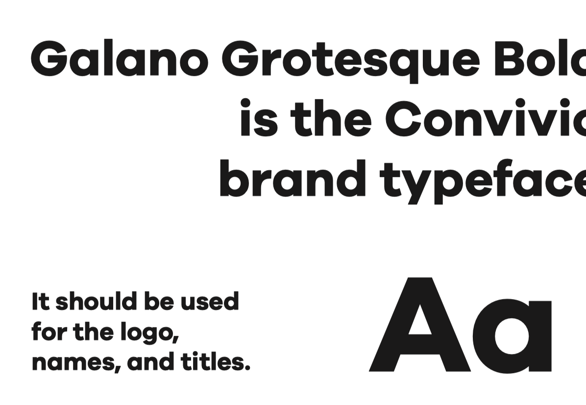
Typography
Galano Grotesque Bold is the Convivio brand typeface.
It should be used for the logo, names, and titles.
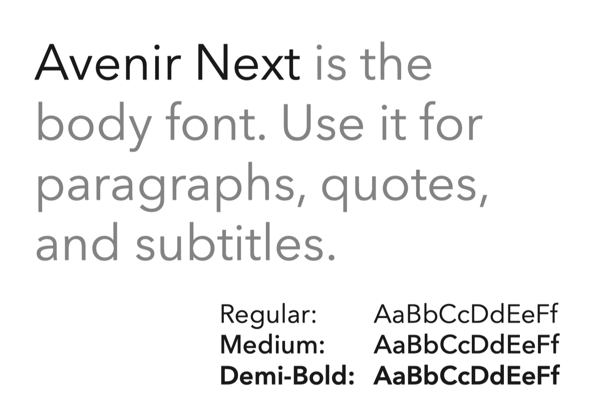
Avenir Next is the body font. Use it for paragraphs, quotes, and subtitles. We use Regular, Medium, Demi-Bold weights.
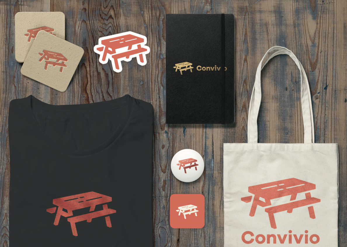
Print Usage
The visual identity can be used strikingly on a wide variety of print products.
Credits
Our visual identity was developed by the wonderful humans, Zach and Laura, at Superhero Studios
It was developed collaboratively with the whole Convivio team.